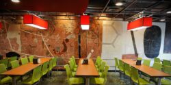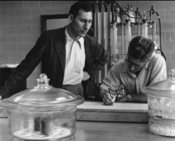
The Atrium Mural (originally the College Union Mural) was completed in 1954 by Associate Professor of Design and World War II Veteran, Manuel Bromberg. The first of its kind, the Mural was commissioned by Jerry Erdahl in hopes to create a conversational piece for students across different fields of study.
The design of the work includes over 50 different elements of science, math, and design (detailed at the end of this entry). Bromberg collaborated with professors on campus and also with students to incorporate unique symbols from textbooks, blackboards, and papers. Before the last layer of plaster set, Bromberg opened up numerous textbooks and invited students to carve any symbol they could find in the textbooks into the wall with a beer can opener making this a truly representative collaboration from NC State, 1953-1954.
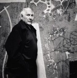
Manuel Bromberg, the creator of the plaster mural in the Erdahl-Cloyd wing of NC State’s Hill Library, is an acclaimed international artist.
At 23 years of age, Bromberg was awarded three post office projects in the Federal Works Fine Arts Commission’s 48 state mural competition. His award-winning sketches were reproduced in Life Magazine in 1940.
 Attracted to his work as a muralist and painter, the war art advisory committee selected Bromberg in 1943 as one of three official war artists for the U.S. Army’s European Theatre to go to an active war theatre and there obtain a graphic record of the war. In 1944 he had received a Citation for Legion of genius and an artist and has displayed unusual courage and initiative as a soldier by taking voluntary risks under fire in order to give a proper portrayal of our army in action. Today his war drawings and paintings are in important collections including the Smithsonian, West Point Museum, FDR Library and the Battle of Normandy Memorial Museum in France.
Following the war, Bromberg was awarded a prestigious Guggenheim Fellowship. In 1949, as Associate Professor of Design, he came to NC State University’s School of Design to teach painting, drawing and basic design. At the time, the School of Design was being projected into the mainstream of the Modern Movement for architecture. The best students of the best schools were coming to study with a faculty of international influence which included George Matsumoto, Matthew Nowicki, Terry Waugh, Eduardo Catalano, James Fitzgibbon and Duncan Stuart. Even Mies van der Rohe and Eero Saarinen heard of the school’s reputation and came to check it out. Frank Lloyd Wright appeared as a visiting lecturer; Buckminster Fuller was on the teaching staff while also working on his geodesic dome. North Carolina’s School of Design was attracting the people who were going to be the rising stars in the modernist movement.
It was during this exciting period of the School’s influence beyond North Carolina that Bromberg was approached to design a mural in architect William Dietrick’s new building on campus, the Student Union. George Matsumoto, head of interiors, and Jerry Erdahl, first director of the Student Union, hired Bromberg to create a mural for a 40-foot long wall in the cafeteria. As a gathering place for students of diverse disciplines, Erdahl wanted the mural to be a conversation piece among the students.
Bromberg’s solution to the client’s request reflects the artist’s genius and outrageous approach to do what had never before been achieved. He set out to create a wall, rich in nontraditional symbols and scribbles, which represented each major field of study at N. C. State University. This he began by visiting the many blackboard drawings in professors’ classrooms and by studying textbooks for unusual symbols.
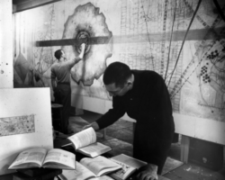
Next, Bromberg built a mock-up wall in an abandoned engineering building on campus where he created a cartoon drawing (7-feet high and 40-feet long). His drawing of symbols and scribbles met with great enthusiasm on the part of the client. Everything, however, changed when the artist visited the completed site: the proportions of the mural didn’t feel correct for the 80-foot long room. The wall itself was unplastered and so, out of curiosity, Bromberg visited the upstairs of the building where the plasterers were working. The medium with its tactile quality grabbed his attention. Knowing nothing about plaster, he asked for samples of acoustical and wall plaster and back in his workspace he experimente d. Chance provided yet another element. There, in the space’s latrine, Bromberg uncovered boxes of dry pigment which spontaneously mixed into the plaster. In a moment of pure experimentation, he broke loose from his original medium for the mural, painting, and decided to make a plaster mural going from floor to ceiling.
Bromberg credits the client for having blind faith in an untested idea and agreeing to it. He proclaims, “Erdahl took a great risk.” As an unexplored medium for a mural, the artist was operating on complete guesswork and innovative daring. How much pigment could be added to the plaster without destroying the integrity of the plaster? Would the wall crack when it was completed? (Note: after the building had settled, the opposite wall in the cafeteria did crack and had to be redone; Bromberg’s wall did not.)
At the site, and under Bromberg’s direction, the plasterers troweled on the first layer of grey, as a scratch coat to grab the plaster. This was followed by a thick, brown plaster. When the next layer was applied in white, it turned a beautiful shade of shrimp. In other areas, Bromberg used black plaster. Each layer was troweled on in 1/4″ thick amounts, resembling a collage.
The next stage involved the application of symbols and scribbles. Focused on producing a random quality to the wall (which we know as graffiti today), Bromberg created a variety of hard-edged diagrams, organic shapes, and microscopic and macroscopic elements. For handwritten marks of different sizes and shapes, he gathered examples from both professors and students. He even created an art happening on-site involving a group of architecture students from the school of design. While the final coat of plaster had yet to set, Bromberg handed out textbooks from all different departments, beer can openers, and gave them instructions that anywhere you want over the wall, pick a symbol from a textbook and carve it into the wall.
In its final stage, Bromberg and his student assistant, Ligon Flynn, worked with direct cutting into the three layers of colored plaster. Setting up structural divisions, Bromberg cut away a lot of the wall with pickaxes. Again, it was pure guesswork and a work in progress as he subtracted areas and the added back new layers. Buried under the outer layer of plaster are lost treasures; for instance, the Ten Commandments (in Hebrew) and a diagram of the magnetic field.

Bromberg returned to NC State in 1998 to assist his daughter in preserving the mural to its current condition.
Completed in 1954, the plaster mural was the first of its kind. Just as the School of Design in the 1950s established itself as a forerunner of Modernism in architecture, Bromberg’s mural anticipated an entire movement in art. His unique vision created a medium never before tested. He took the wealth of knowledge of his time and put its universal symbols on a wall. And, he abandoned hard-edge painting for an organic expression: layers of strata in cracked earth. In viewing his mural, one is reminded of the Lascaux cave walls with its resplendent colors and textures. In his time, Bromberg too had dared to create that which is missing.
In the late 1990s, the NC State Visual Arts Center gave its approval to renovate the mural, which was carried out under the direction of the artist’s daughter, Tina. In making the mural, Bromberg thought future students would probably add their own graffiti. Therefore, removal of graffiti was minimal. Of primary concern was an effort to reclaim the contrast of colors as created by the artist in 1954. Years of accumulated nicotine and an overspray of a yellowing shellac dulled the original brilliance of the mural. Once the wall was cleaned, Bromberg himself returned to work alongside his daughter to preserve the mural and its new beauty.
For more about Manuel Bromberg, visit www.manuelbromberg.com
Elements of the Mural
- 1. Parallelogram
- 2. Microphoto of soil physics
- 3. Trimetric projection
- 4. Detail of working drawings for a building
- 5. Microphoto of soil structure
- 6. Electron moving about nucleus with angular or momentum and spin vectors
- 7. Pi
- 8. Epidermal leaf cell
- 9. Plus sign
- 10. Aerodynamic flow around shape
- 11. Particle Tracks scattering of protons
- 12. Virus series
- 13. Endodermal Cells
- 14. Tracks of a pair of electrons
- 15. Carnot Cycle thermodynamics
- 16. Freud’s Theory of Ego
- 17. Neutron source: fast and slow radiation
- 18. Parabola
- 19. Quantization of direction
- 20. Positive-negative charges around shape
- 21. Microphoto of iron structure
- 22. Spectroscopy-quantum theory
- 23. System of polyhedron analysis
- 24. E=Mc^2
- 25. Volt-Ampere curve of a pentode
- 26. Induced current and charge diagram showing electrical field
- 27. Path of a charged particle in a magnetic field
- 28. Coordinates
- 29. Stress-strain formula
- 30. Nuclear stain (cell nucleus)
- 31. A desmid cell (an algae)
- 32. Mu, Greek letter Symbol
- 33. Chromosome with spindle fiber
- 34. Light refraction lines
- 35. Surface tension diagram of the rise of liquids in capitallary tubes
- 36. Maxwell?s equation
- 37. Tail forceps of an earwig
- 38. Algal cells
- 39. Nusselt’s equation of heat transfer
- 40. Tube of flow showing streamlines of fluids
- 41. Graph of relative rates of photosynthesis in different wave lengths of light of equal intensity
- 42. Chromosomes
- 43. Sythesis of matter
- 44. Football Play Diagram
- 45. Shower of cosmic rays?electrons and positrons
- 46. Electrical series, RCL circuit
- 47. Mohr’s stress circle
- 48. Square
- 49. Electron Spin
- 50. Rectangle
- 51. Vector of forces
- 52. Female genetic symbol
- 53. Diagram of animal endocrine system
- 54. Growth regulator, molecule
- 55. Right angle
- 56. Signature
- 57. Vector diagram of an electro-magnetic wave
- 58. Signs of coordinates of a point
- 59. Egg